
Homepage Essentials for Generating Leads
Your homepage may be the most important page on your website, yet so many companies get it wrong. If you feel your homepage is performing poorly, confusing your site visitors, and turning business away, then you’ve come to the right place. Armed with the information below, you can run a self-audit, make the necessary changes, and start winning new business right from your homepage.
Let’s get started!
The Challenges of Website Homepages
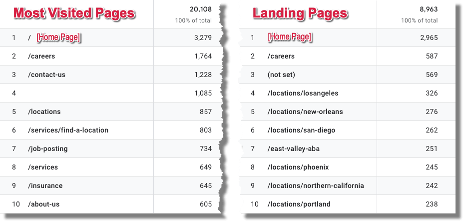
When I review the analytics of a client’s website, the homepage is almost always the most visited page on the site. (If they actively blog, sometimes a few popular posts might top it, but I digress.)
It also tends to be the most popular landing page, meaning it’s the first page someone visits at your site. Another way of looking at it is that your homepage is the first impression a new prospect gets of your business.
This happens for a few reasons:
- When another site links to your site they most often link to the homepage,
- Every page on your site links back to the homepage, either in the navigation or through your logo, and
- If someone searches specifically for your business name, your homepage is almost always the most qualified result.
Let’s face it: your homepage is your business’s front door, its lobby, and its store window display. Set the wrong tone here, give the wrong or a confusing first impression, and your opportunity of landing the business is gone.
And unfortunately, this happens way too often. Because besides being the most popular landing page, it’s often the most popular exit page, or the page visitors leave your site from.
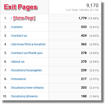
Sometimes that’s because people get to your homepage and realize that you’re not the right type of solution for them. That’s fine. However, more often than not, it’s because your homepage hasn’t done its job: it hasn’t built trust, it hasn’t addressed the person’s pain points (reasons for visiting), and it hasn’t convinced them that you can help.
In short, it hasn’t inspired them to move forward and dig deeper into the website.
If you feel this is happening to you, keep reading. In this article, I’m reviewing some of the homepage best practices that will help you build trust and get site visitors to take action.
What Your Website Homepage Needs to Do
While different businesses may have different homepage needs, there are a few critical things that all homepages need to accomplish.
Build Trust with Your Site Visitors
In the real world we build trust over days, weeks, even years. But on the web we only have a few seconds to establish trust with the people who come to our site.
That means we need to leverage some “weapons of influence” as Dr. Robert Cialdini called them in his seminal book, Influence: The Psychology of Persuasion. These include authority, social proof, reciprocity, and others. I’ll give examples of how you can leverage these on your homepage down below.
Make It Clear Whether Your Business Can Help
As soon as the page starts loading, we need to let people know that they’re on the right path to getting help. We do that through navigation, page copy, and imagery. Using specific language and on-message photos and videos can make all the difference.
Provide Direction for the Customer Journey
If someone is coming to your homepage for the first time they may not be ready to reach out, buy now, or even sign up for our email newsletter. They may need more information, see how you’ve helped similar people/businesses, or read through some of your case studies.
Your homepage needs to quickly direct your prospect along their own personal customer journey.
Generate Leads Right from the Homepage
Of course, some of your website traffic may be returning. Or they may have gotten a great word of mouth referral about your business and they’re ready to reach out. Or their basement is flooded, their accountant just got arrested for fraud, or they’re only allowed one phone call and they need to make it count. In other words, they’re in dire straits and they need to reach someone now.
For that segment of the audience, you need to make contacting you quick and easy with easy-to-find calls to action, before they even start scrolling.
The Framework for a Lead Generating Homepage
When I look to improve a company’s homepage, I visually break the page down into three sections:
- Above The Fold – What the typical visitor will see without scrolling
- The Supporting Scroll – Where we bolster our credibility as visitors scroll down the page
- The Strong Finish – A final call to action, additional company information, and odds and ends to win the business.
There aren’t hard lines between these sections, but they are meant to help you tackle your homepage renovations in manageable sections. Let’s dive in.
What Goes “Above the Fold” on Your Homepage
How much someone sees of your home page can differ based on their screen resolution, the device they’re using, and how big their browser window is when they arrive. When trying to determine what appears above the fold on your home page, you should at least be visiting it on a typical desktop/laptop computer and a smartphone, as those tend to be the extremes.
Unless they’re motivated, many people won’t even bother scrolling down unless you persuade them to do so. That means that you need to convince them early.
Let’s take a look at the elements that typically appear above the fold and how they can increase your chances of winning the business.
Your Logo
Almost every website in the world has a logo (or type treatment) at the top of the page. Your logo is a great way to start establishing your brand and letting people know they’ve arrived in the right place.
While there’s plenty to consider with your logo, here are a couple of things to keep in mind when it comes to your homepage:
- Don’t make it too big. It’s a running joke in design firms that the clients always want to “make the logo bigger.” You don’t want to overwhelm the design with your logo, nor do you want it to push the content too far down the page.
- Make it legible. Often, when we shrink down a logo to fit at the top of the page, especially when it comes to the mobile version, any words that were in the logo become illegible. If this happens with your logo, consider designing a version especially for the web.
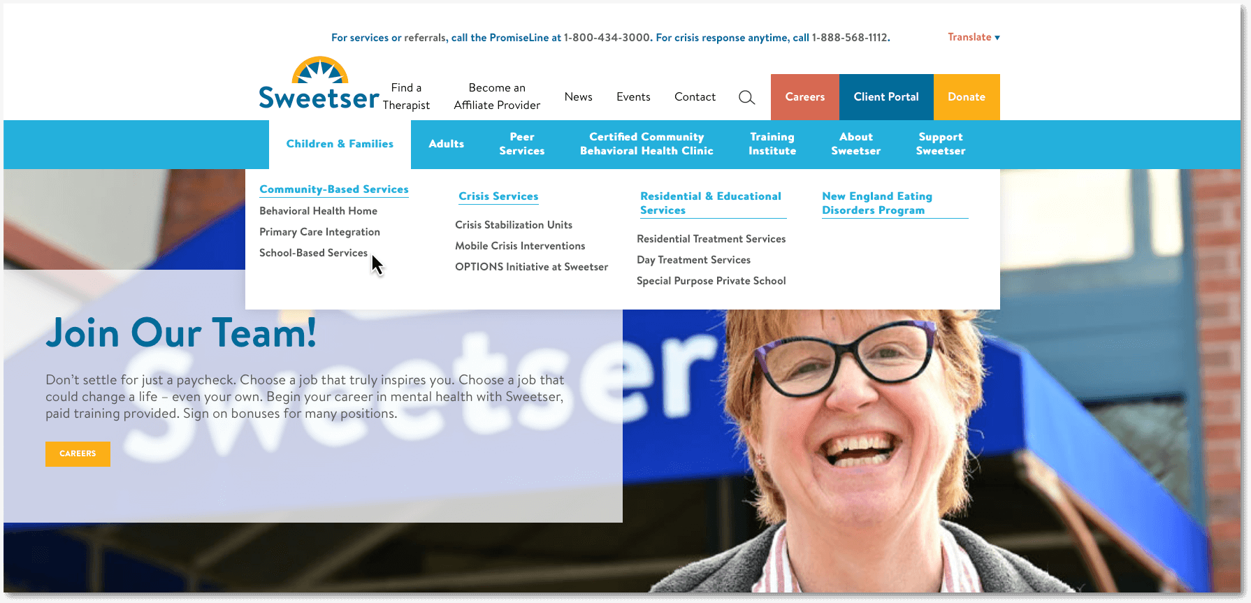
Website Navigation
The purpose of navigation is to help site visitors get around our website quickly and efficiently. But it’s also an opportunity for us to identify the most important sections and pages of our website and reinforce to our visitors that they are in the right place.
So why would we create vague, generic navigation labels that could be used on a million different websites in hundreds of different industries?
Wherever possible, use industry-specific language. Here’s an extreme, but not exactly uncommon example:

What do they do? Dentistry? Architecture? Commercial Cleaning?
Here’s an example from the same industry:
This is much more specific, reinforcing to the site visitor that they are in the right place.
Your navigation isn’t meant to link to every page on your website, just the most important ones. The more items in your navigation, the less important each one becomes.
If you have a larger site, one way to manage this is with dropdowns for secondary navigation items, or even by using a “mega-menu” approach, that helps you organize many pages in accessible ways.
Finally, you may work with a number of different industries, job titles, or have different services for retail clients vs. wholesales. If this is the case, consider employing a user-centric navigation tab.
This is often labeled “Who We Work With”, “Industries Served,” or even broken down into groups, such as “Students,” “Parents,” and “Faculty.”
Contact Information
Some people come to your website ready to connect; for those people put your contact information right at the top of the page.
You can do this by including a Contact tab in your navigation or by including your phone number in the top right corner of your homepage. Because many people will be on their smartphone, make sure your phone number is clickable so they’re only one thumb tap from speaking with you.
Descriptive Header
Too often, we choose cleverness over clarity.
Take a look at the opening header on this homepage:

What do they do? This generic copy could be the vague promise of a dozen different companies or even industries. Are they HR Consultants? Personal trainers? Maybe property managers based on the photo?
Not only is this a missed opportunity to make the site visitor feel like they are in the right place, it’s a missed opportunity for SEO. This text is usually an H1 tag, one of the best places to optimize for your target keywords.
Just imagine if this headline read:
- Southern Maine CPA Services
- Serving Business Accounting Needs for Over 20 Years, or
- Forensic Tax Services for Maine Businesses
You get the idea. Immediately, we’d know if we were in the right place.
Descriptive Body Copy
Sometimes homepage designs lend themselves to adding some descriptive copy below the headline, further explaining what we offer. Or better yet, addressing the needs, problems, and pain points of our site visitors.
As appropriate, you can include links to relevant sections of your website here.
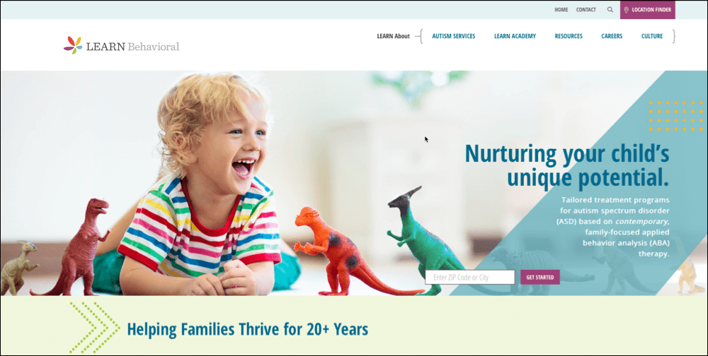
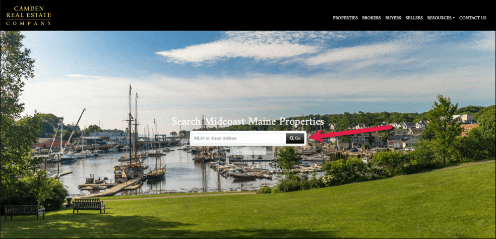
Hero Image
We’re visual creatures. We make snap judgements about business, people, and of course websites, based on what we see. In other words, we regularly judge a book by its cover.
So a hero image–a large photo or video–at the top of our homepage is a powerful tool for establishing credibility, reinforcing that we can solve our visitor’s pain points, and even telling a story or setting the mood.
Pro-tip: If your hero image includes people, use photos where they are looking in the direction of important text or CTAs. Research shows that we take cues from images on where to focus our attention.
Before we dive in, let’s address the elephant in the room: should you have a slideshow on your home page?
Slideshows–a carousel of rotating images–were extremely popular for years. Web designers loved using them because they were cool and hip. Site owners loved them because it allowed them to show off a wide range of services in a smaller footprint. There was the idea that people didn’t want to scroll long pages, and so the slideshow would avoid that.
Then came the inevitable backlash.
One issue is that clickthrough rates are lower for slideshows than other parts of the site. If you’re trying to drive traffic to different sections of your website, a slideshow isn’t the way to do it.
Another issue is that often businesses put text on every slide without giving the visitor enough time to read and digest what you’re sharing with them. Do you think that makes a positive or negative impact?
(That was a rhetorical question.)
Third, the more images in your slideshow, the slower your page will load. Slow load times can lead to lower search engine rankings and definitely lead to lower conversion rates as people get frustrated and click away.
So, is it ever OK to use a slideshow on your home page?
Absolutely! It just depends on what you’re looking to do. If you have a number of images you want to show–like different houses on a real estate site or different paintings on an artist’s website–a slideshow can be a great way of showing people your options or range.
Just don’t expect a lot of clickthrough activity on your slides and keep your copy to a minimum.
So, whether you are going with a slideshow, a single image, or a video, here are some best practices for your homepage hero image:
- Relevancy – Make sure that the images are relevant to your business. We recently worked with a waterproofing basement company that had inherited their site from the previous owner. The hero image was of a beautiful home. Unfortunately, it was impossible to tell if the home even had a basement! A better choice might have been a family happily playing together in their basement. Or, if you wanted to focus on pain points, a basement full of water with games, photos, and files floating everywhere.
- Authentic – Whenever possible, you should use actual photos of your business, your people, your customers, and your work. Depending on where you live, hiring a professional photographer for half a day might cost just a few hundred dollars. If you’re just starting out, you may not have the ability to use authentic photos. If that’s the case, stock photography is an option, but hopefully only a short-term one. As soon as you are able, swap out those stock photos for authentic ones.
- High quality – Whether you use original or stock photography, make sure it’s of the highest quality. While there are places for more amateur-level photos, such as social media or blog posts featuring before and after shots, your homepage isn’t one of them. This is why I recommend hiring a professional who will show up with a high-end DSLR and understand angles, lighting, and the rule of threes.
- Fast loading – With all the images on your site, you want to minimize the byte size of these images, while not losing quality. At flyte we optimize these images in a tool like Photoshop, use the Smush WordPress plugin to further shrink the file size, and finally host all of our images at a CDN for faster download times.
Include a Call to Action
For those ready to move forward, make it dead simple for them. Many sites employ a single, strong, call-to-action that gets visitors engaged. If that serves your lead generation strategy, go for it.
What Shouldn’t Go Above the Fold
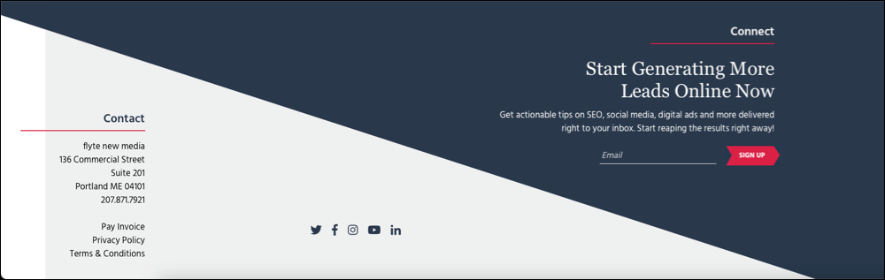
Although they were popular for a while to show how forward-thinking and connected you were, social media icons don’t belong at the top of your homepage.
You worked really hard to drive all this qualified traffic to your website, why would you now try and get them to leave? Why would you have links to sites like Facebook and Instagram, which–no offense–are likely a lot more fun and engaging than your website. And filled with their friends and families…and cat videos?
Move those social media icons to the footer of your page where they belong.
What Goes In the Middle of Your Highly Effective Homepage
Not everyone is going to make an instant decision. Assuming you did your job above the fold, many will continue their journey down the page.
For those intrepid travelers, here are some of the elements to include on your homepage to win them over.
Using Authority to Build Trust on Your Website
Many site visitors may be looking for a level of expertise, certain certifications, or proof that you are a reputable business. This is where “badges of authority” come in.
Perhaps you are board certified. Maybe you have a perfect score from your local Chamber of Commerce. Maybe you’ve won the “Best of” award from your local newspaper for the past several years.
All of these “badges” can be added to your homepage to assure site visitors that you are a reputable company and not some fly-by-night operation.
Two pro tips for making the most of your authority badges:
- Desaturate the authority badges – If you have several badges to show, they may have many different colors, competing with each other and the color scheme of your homepage. Instead, make them all one color and resize them so they look balanced.
- Don’t make them links – The purpose of these badges is to establish your credibility, not to leak traffic. Why would you send someone to a trade organization’s website where they also link to dozens or hundreds of your competitors?

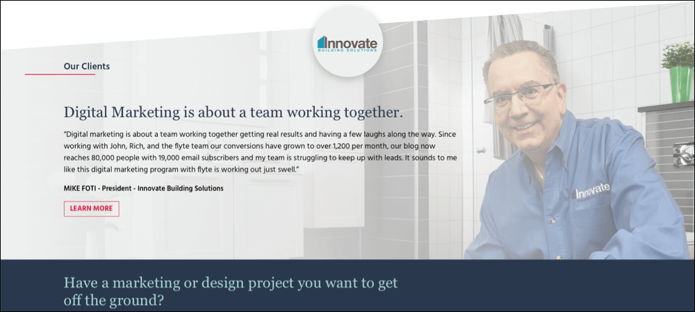
Use Social Proof to Win Business on Your Homepage
Another approach to helping a visitor overcome fear of loss is through social proof. As social creatures, we often look to others’ behavior to influence our own. If other people that seem similar to us took an action that worked out for them, it feels safer for us to take the same action…in this case, working with you.
The best way to leverage social proof on your homepage is through customer testimonials. Our friends at Orbit Media have a great post on maximizing customer testimonials, but here are my favorite tips…all of which require your customer’s permission, ‘natch:
- Use their full name – A full name breathes life into the testimonial. Just saying “satisfied customer,” or “CEO,” or using their initials makes this person seem two-dimensional and more likely to be made up.
- Use a photograph – Again, this just makes the person feel more real. It’s not that you couldn’t have grabbed some stock photography, but it’s unlikely. Bonus points for using a photo that also includes your work.
- Use specific keywords – When possible have the customer include descriptive keywords that describe your products or services…this can also help with SEO.
Here’s an example of a testimonial that appears on our website.
Another approach to social proof are reviews. (Testimonials appear on your property, reviews appear in places you don’t control, like Google or Yelp.) There are plenty of tools that will bring in feeds automatically from these sites. Just make sure they’re primarily positive reviews!
Get Specific with Your Services
Maybe your individual services were hidden behind a dropdown menu the visitor didn’t click. Or maybe they just need a refresher. Whatever the reason, having a section on your home page where you further tease your offerings can drive traffic and sales.
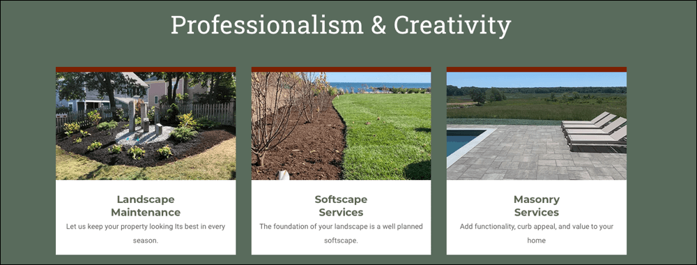
I especially like what this company does, as not only do they use specific language that’s keyword-rich and good for SEO, they back it up with descriptive text and illustrative photography.
Further, each one of these services goes to an individual service page that goes into even more detail (again, great for SEO.)
Leverage Case Studies and Statistics
Just saying you’re the best rarely convinces anyone. Most people will want to see cold, hard facts.
For this audience, include Case Studies (or tease the Case Studies and link to them on another page) that explain a client’s problems or needs, how you approached the problem, and what the outcome was.
Another alternative to this is in statistics. Telling people you’re Maine’s biggest ski mountain isn’t nearly as convincing as letting them know how many trails, high-speed chairlifts, and miles of terrain they’ll find once they arrive.
Telling people you increase business’s profit margins isn’t nearly as effective as telling them your average client sees a 102% increase in profit margins after just one year of working with you.
Get Personnel
Not a typo. This is especially true with service based companies, but can work equally well with companies that just sell products: people want to work with people.
By showing off members of your team at all levels (not just the CEO), you humanize your brand and make your company feel more approachable.
The Bottom of Your Homepage: Sticking the Landing
You’re in the home (page) stretch now!
Many companies just “dial it in” at this point. Slap in some links, add a privacy notice, and call it a day.
However, there are still some ways that you can increase your chances of winning the business, or at least directing someone to the next step in their customer journey before they hit the bottom of the page.
Last Gas for Two Hundred Miles
Getting someone to the bottom of your homepage, even if they haven’t taken any action yet, is still a good sign. You’ve held their interest all the way down the page, hopefully winning them over with every scroll.
As they see the bottom of the page approaching, include one more call to action. To increase the chances that they’ll take you up on this offer, make it as specific and value-oriented as possible.
Instead of “Contact Us” try “Book a Free Consultation” or “Talk to an Expert Advisor Now” or “Get a Free Quote on Your Hardwood Floor.” You get the idea.
Grab Their Email Address
Maybe they’re still not ready for that level of commitment. Your next best option would be to get them to join your email list so you can stay in touch with them and continue to provide valuable insights and advice to help them on their journey.
However, no one wants to join “yet another email list.” Chances are, you’ll need to include some sort of lead magnet; a free giveaway in exchange for their email address and permission to continue reaching out to them.
Some tried and true examples include:
- A cheat sheet or checklist
- A white paper or other relevant resource not otherwise available on the site
- Access to a webinar
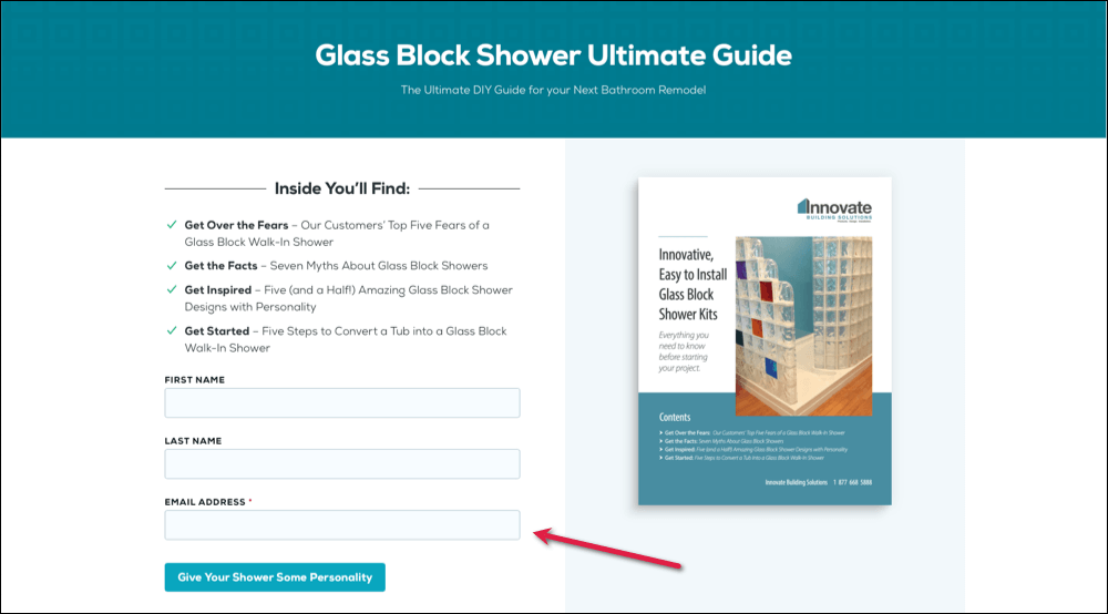
Just make sure this is something that they feel is valuable and you feel is scalable. (An hour-long shiatsu massage for each subscriber is likely not scalable.)
Location, Location, Location
This is good practice for any business, but especially critical for businesses that service a specific area or have customers visit their location. Include your full street address, and consider embedding a Google Map of your location.
Navigation, Site Map, and Other Helpful Links
Don’t ask someone to scroll all the way back up the page to find your navigation again. Repeat the primary navigation tabs down in your footer.
Consider including other pages that are important, but maybe not “navigation” worthy. I’m talking about privacy notices, copyrights, pay your invoice links, and so on.
Putting These Homepage Changes Into Action
Improving your homepage can be part of a website redesign, or it can be done as a standalone project.
Some of the recommendations mentioned above, especially changes to the navigation or footer, may have sitewide ramifications, so just be aware of the impact of any changes you’re making.
Also, you want to make sure that the changes you’re making are having the intended reaction. Make sure you look at your analytics before and after you make the changes. Pay attention to time on page, bounce rate, and drop-off rate of your homepage, as well any other metrics you feel are important.
How long it takes you to get meaningful data depends on how much traffic your site gets. Consider looking at 1,000 visits before and after the site changes to see if your conversion rate is heading in the right direction.
Need help getting started or implementing the changes? If you’re not sure where to start, or just want an experienced partner to help you through, just reach out to us through our contact form and we’ll set up a time to talk.

Rich Brooks is president of flyte new media, a digital agency in Portland, Maine, offering branding, web design, and digital marketing. He is a nationally recognized speaker on marketing, AI, and entrepreneurship.
He founded The Agents of Change, an annual conference and weekly podcast that focuses on digital marketing.
Rich is the author of The Lead Machine: The Small Business Guide to Digital Marketing, a popular and well-received book that helps entrepreneurs and marketers reach more of their ideal customers online.