
What is a Landing Page?
Websites and homepages may be designed for visitors to explore and look around (like a park or a gallery!), but a landing page is designed to move visitors down your sales funnel without distraction (like a tunnel!) Your prospects first see your compelling message via paid ads, email blasts, social posts, or other marketing platforms, click on the link, and are delivered to a landing page that is customized to a very specific, measurable, outcome with a strong call to action.
In essence, landing pages are designed to get users to convert––which means that the quality of your landing page can directly affect your ROI (return on investment.) Improve your landing pages and you'll increase your revenue and profits!
How to Make a High Converting Landing Page
There are specific elements that have been shown to make users more likely to convert (to take a desired action), ranging from the featured imagery to the page formatting. Let’s look at the 8 best qualities of a landing pages that convert users:
1. Have a Dedicated Call-to-Action (CTA)
Harry Nilsson said “a point in every direction is the same as having no point at all”, and we’re pretty sure he was talking about landing page CTAs (maybe).
One of the biggest no-no’s when trying to choose a landing page is sending them to your website’s homepage. A homepage can easily have a handful of CTAs just on that one page: an email signup, a video, links to other pages on your site, and social links, just to name a few. These are all great ways to distract users coming from your paid ads or email newsletters and prevent them from completing your desired conversion for that campaign.
For example, say you’re running a Google Ads campaign that centers around getting users to fill out your contact form and request a consultation with you. You create ad copy that centers around your free consultations, with information on all the topics you consult with clients on. You then send users to your homepage, because you want users to learn more about you and have all the information they need to set up a consultation, right?
Wrong!
Once on your home page, your users are drawn to the Instagram photo feed you have connected to your homepage with the CTA “Check us out on social media!”, and they click off your site and onto your Instagram.
You might be thinking, “this doesn’t sound that bad…they’re still interested in my brand!” And who knows, maybe they’ll peruse your Instagram for a few minutes and find so much engaging and convincing content that they’ll click back to your site and fill out your contact form after all!
However, if you’ve ever used Instagram, you know that the likelihood of going to the platform to view just one profile and then leaving again is almost impossible. Next thing you know they’re watching a video of someone making a doll-sized plate of spaghetti, and they’ve forgotten all about the reason that brought them there in the first place.
While it’s true that they could still venture back to your site at some point, do you really want to pay to run ads that might end up leading users to your Instagram page? You want your landing page CTAs to be laser-focused to give you the best possible chance at getting that conversion.
Here are three tips to improve the efficacy of your CTA:
- Keep it Above the Fold: Once you’ve zeroed in on your desired conversion, make sure that CTA is one of the very first things your users see when they land on your page. One of the best ways to do this, is placing your CTA “above the fold”, which means visible without needing to scroll.
- Scrolling CTAs: If you have a landing page that requires lots of scrolling, you can employe multiple CTAs at different points throughout the page, or have a CTA that moves with the visitor.
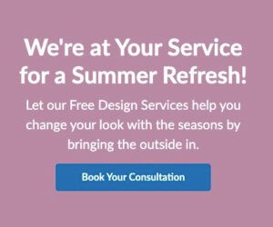
On flyte’s website we use different “sticky footers” that travel down the page with users as they scroll:

- Make it Easy to Convert: If you want users to fill out a form, don’t make them fill out every single piece of information you’ll need from them down the road. Instead, choose the minimum amount of fields you can get away with to follow up with them, and use that to follow up on the rest of the information later. This can usually be accomplished with just the name, phone number/email, company (if you’re B2B), and maybe an optional box to submit any more information they’d like you to know. Once you have their name and email or phone number, you can contact them for everything else you need.
Another way to make a form fill more likely to convert is by enabling autofill in your forms that loads in user’s information without them needing to type it in.
2. Create a Thank You Page
Create a “Thank you” page that users are led to after completing your desired action. They filled out a form? Send them to a thank you page. They signed up for your email list? Send them to a thank you page. Here’s why:
- They can lead to additional conversions: Add a CTA to your landing page that prompts users on to the next step of your desired journey. If they filled out a form, you can then lead them to specific blog posts or prompt them to receive regular updates from you in your email newsletter. This is a proven psychological approach, because people like to be consistent. Once someone says yes to something–even a small yes–they are more likely to say yes to something larger. “Yes” to signing up for a free ebook becomes “yes” to signing up for your next webinar or paid course on a thank you page.
- They make it easy to track conversions: One of the easiest ways you can track which users are converting is to create a thank you page that users are only led to after completing a specific conversion. You can then place a tag on this page (we recommend doing this through Google Tag Manager) so that when you view your page data in Google Analytics, you know that every view on that page was someone who completed a conversion.

C&L Aviation Group features a video from their YouTube channel, as well as their latest news––potentially leading users on two separate journeys after filling out their contact form.
3. Add (the Right) Visuals
Add high-quality imagery or videos to your landing page that display what you do or the products you sell. The cliché “a picture is worth a thousand words” is a cliché because it’s true! While it would be amazing if written content alone could convince users to convert, the reality is that people are drawn to visuals.
Ideally, you want to use your own imagery, but stock photos can do the job as well––just try your best to find unique photos that don’t look so….stock photo-y. You know what I mean: the types of photos that could (and probably have been) used in a thousand different ads for a thousand different industries, that just don’t look like you actually took the photo yourself (even if you didn’t, you still want it to look like you did).
4. Include The Right Amount of Information
There is a fine line between providing enough information for users, and adding too much text to one single landing page. The latter can confuse and overwhelm users, especially if not formatted in an appealing way.
While there isn’t an exact formula to share here, these are a few best practices when it comes to the text on your landing page:
- Use headers and subheads to break up the page and let your visitors scan for the information they want.
- Differentiate font size and weight to avoid looking cluttered.
- Use bullets where you can––they are easier for users to digest in a short amount of time.
- Provide information that covers your biggest FAQs so users don’t leave your page because they have too many questions.
- Share some background on your business, your goals, history, and so on.
Again, there's no “one size fits all” here. If your sale requires a lot of copy, video, testimonials, and so on, include it! Just make sure the page is easy to read and scan. If you're not sure how much copy to include, experiment! See #8 for more thoughts on that. (But don't skip all the good stuff in between!)
5. Leverage Social Proof
We're all influenced by the actions and decisions of others. Whether it’s the products they purchase, the restaurants the visit, or the places they travel to––we look to others to help us make decisions for ourselves and validate those decisions.
Here are a few ways you can bring this concept to your landing page:
- Customer Reviews: More than ever before, users are relying on other customer’s reviews to make an online purchase. In fact, in 2021 54.7% of consumers said they read at least four product reviews before purchasing a product. Though ultimately reviews on Google and other platforms are the most likely to sway users, it’s still important to feature them on your landing pages. This can bring down the fear of loss, knowing that your product or service helped someone in a similar situation.
- Customer Favorites: Do you have products that are favored by your customers? Let users know that on your landing page.
- Media Features: Has your business recently been mentioned in an article? Highlight it in your landing page as a way to build trustworthiness and credibility to your business.
- Show Your Authority: Does your business have any authority badges, awards, or important certifications that might set you apart from your competition? Add them to your landing page!
- User Generated Content: What better way to show that your products are successful than seeing it in content created by your users themselves?

The hair product brand oVertone uploaded a feed of user generated content to their landing page that was obtained by users on Instagram who used the hashtag #oVertonecolorIRL.
6. Optimize Your Landing Pages for Mobile Devices
Have you ever been browsing the internet on your phone and clicked onto a landing page that wasn’t optimized for mobile devices? If the page required side-scrolling to read text, that text was far too tiny to read on your phone without zooming in, or the links were too small and close together to click easily––you have been a victim of a landing page that wasn’t optimized for mobile devices.
In 2021, over 90 percent of the global internet population uses a mobile device to browse online, so if your landing pages aren’t mobile optimized, you might be missing out on 90% of your potential internet traffic!
It’s not enough for your landing page to just be accessible on mobile, it has to provide a seamless experience by having the following qualities:
- A single column layout: While your desktop landing pages can feature multiple columns, a mobile landing page needs to be streamlined into one column that allows you to scroll and read.
- “Thumb-friendly”: Users generally scroll and click using their thumbs, so the text links and buttons need to be large enough and spaced out enough to accommodate those opposable digits.
- Simple navigation: While many desktop sites display their navigation across the top of the page, mobile sites generally utilize the “hamburger” style navigation menu that expands when clicked, and features large enough text that is easy to click.
- De-cluttered formatting: Space out your content so that it’s as readable as possible.
- Optimize for all screen sizes: Make sure to optimize specifically for Androids, tablets, and iPhones, as each of these display differently.
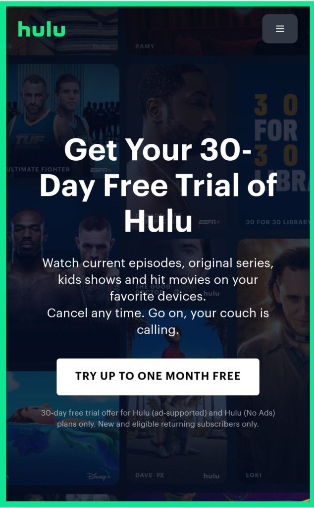
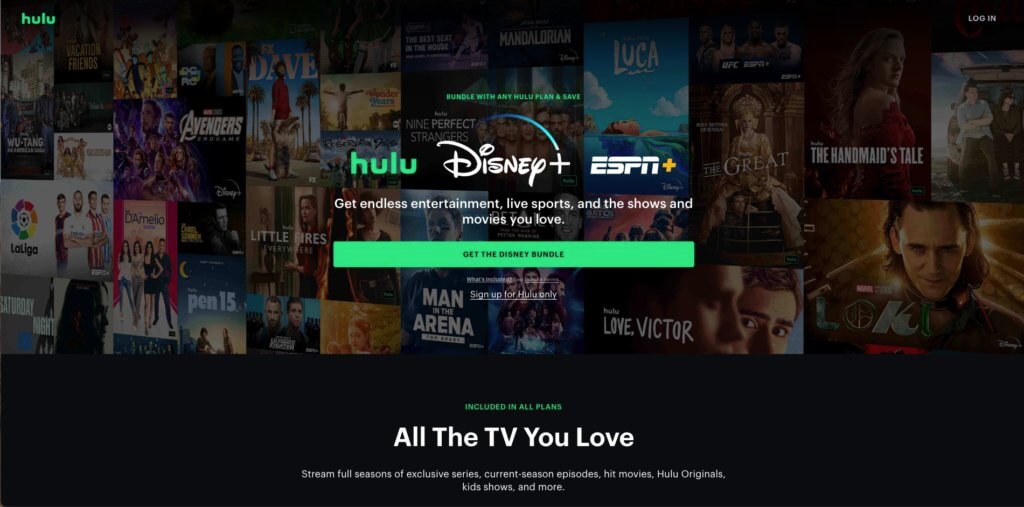
You can see above how different Hulu’s website looks on mobile vs. desktop (below).
7. Remove Page Navigation
This might seem counterintuitive, but it's a proven way of making sure users aren’t distracted by other pages on your site and keeping them on your page so they’ll convert. Just make sure to add plenty of information, as these users won’t have access to the rest of your site if they have unanswered questions.
8. A/B Test Your Landing Pages
Like most marketing efforts, landing pages should be split tested to determine what elements are the most effective. How do you know if you have the best CTA possible? Or whether adding more (or less) copy to the page would lead more users to convert? While the elements we've mentioned so far in this blog post are tried and true best practices, the only way to truly know for sure what will perform best on your landing page is to test it yourself.
So, how do you test your landing pages?
-
Create a variant of your original landing page: Remember to only change one element on the page, otherwise you'll have no idea which of the changed elements were what lead to more or less success. Here are some common landing page a/b test elements to get you started:
-
- Page headline
- CTAs
- Copy
- Page layout
- Different images/video
- Video vs. images
- Form fill variations
-
- Choose an A/B testing tool: If you're testing out landing pages for your Google or Microsoft ads, they actually feature A/B testing tools directly in their respective platforms! However, if you're testing out any other type of landing page, you'll need to choose from one of the many existing tools to do so. Luckily, VWO put together a list of their top choices for A/B testing, both free and paid tools. These platforms help guide you along your A/B testing process, and help you establish a winner.
- Wait for the data: It can be tempting to act as soon as you see a pattern forming, but you want to wait until you receive a solid amount of data before making a decision. While I wish I could provide a specific amount of time, it really all depends on the level of traffic you receive to your landing page. At flyte, we generally prefer to run these tests for a minimum of one month, but if we haven't received a substantial amount of views, or the data is still unclear, we'll run them for longer.
- Keep Testing! Once you've established a clear winner, repeat the process with another element on your landing page. If your first test proved that a larger CTA button was more effective, use that version as your starting page and create a new variant of that page to test it against. You don't need to keep testing forever, but if you want the best results possible, doesn't it make sense to test every possible variable on your landing page?
9. Bonus: PPC Landing Pages
Surprise! We promised you 8 landing page best practices, but as a bonus for making it to the end of the blog post, here are a few additional elements to include if you’re specifically sending users to a landing page from paid ads.
- Feature your keyword(s) throughout: If you’re advertising on a search engine like Google or Microsoft (formerly Bing Ads), you’ll want to make sure your keywords can be found throughout your landing page. Google crawls these pages to ensure that they are serving users the best possible information to match their search, and the primary way they do this is by ensuring that the content on your landing page matches up with what users are seeing in your ads.
- Retarget users who visit your landing page: If you’ve ever wondered how brands are able to haunt you with their products after you viewed them previously, it’s because they set up retargeting on their product pages. Add a retargeting tag to your landing page so that you can serve them specific ads later on––just make sure you remove the users who do convert from your retargeting. As we mentioned above in the “Thank You” page section, we prefer to do this using Google Tag Manager.
Final Thoughts
Landing pages are a critical tool to generating more leads and increasing your sales, profits, and revenue, but many people either don't use them at all, or aren't optimizing them for the best possible ROI. By adding or improving landing pages on your website, you will see better results day after day. Just start adding in some of the features listed above and keep testing and experimenting!
If you need some help with your next landing page, we’re here to help. Our in-house Design and Development team has designed and developed (see what I did there?) hundreds of successful landing pages for our clients, and we’d love to help with yours too!

Rachel was born and raised in southern NH, and became an official Mainer in 2016. With an academic background in psychology, she brings to flyte a passion for people and a fascination with what motivates them. This, combined with her artistic skillset, made the decision to pursue a career in marketing a no-brainer.
With a big sense of humor and sentimental nature, she becomes the “morale booster” of whatever group she’s in.
Outside flyte Rachel can usually be found doodling in her sketchbook, doing spot-on impressions (if she does say so herself), or binging the latest Netflix competition show.