
Whether you have a lead generation (lead gen) site, an e-commerce site, or a hybrid of both, chances are you're looking to generate more leads and sales from your website. In this article we're going to look at a five step process that will improve your website, increase your conversion rate, and generate those leads and sales that will help your business grow and thrive.
What is Conversion Rate Optimization?
 Conversion Rate Optimization, or CRO, is the process of increasing the percentage of your website visitors who take a desired action on your website.
What that desired action is, is completely up to you. It could be tied directly to revenue, such as completing a transaction or booking an appointment. Or it could be a step along the way, such as adding an item to their cart, registering for a free webinar, signing up for an email newsletter, or even just watching the first 15 seconds of a video.
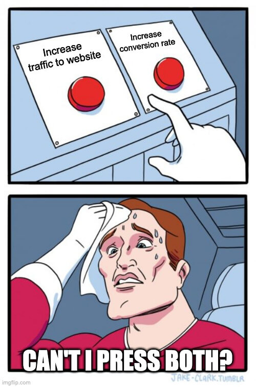
There are two main ways to generate more revenue from your website:
- Increase the number of qualified prospects visiting your website, or
- Increase the percentage of people who “convert” at your website…moving further down the sales funnel or along the customer journey.
How Do You Calculate Conversion Rate?
If you want to improve your conversion rate, to optimize it, you'll first have to measure it.
While calculating conversion rate does require math (?), it's not rocket science. It's simply the percentage of visitors who take a desired action. If three people sign up for your email newsletter out of every 100 who visit the signup page, your conversion rate is 3%.
If you feel like flexing your math muscles and you have a chalkboard or whiteboard nearby, it looks like this:

I think it's important to note that the above graphic does not use Comic Sans. It’s called Chalkboard. No fonts were harmed in the making of this graphic.
What is a Good Conversion Rate?
It depends. (Sorry, but it does.)
If you go online you'll see “2% – 5%”, “over 10%”, or “between 5% and 15%” in response to this question.
None of these are right…or wrong. Conversion rates differ between industries, between B2B and B2C companies, on what you qualify as a “conversion”, and depending on the length of your sales funnel. If you measure a conversion when someone “adds to cart,” you're definitely going to experience a higher conversion rate than someone who measures conversions only after checkout.
If you do want to get a baseline, just Google “average conversion rate for [your industry here]” and you'll likely find some research done by optimization software companies that will put you in the right ballpark.
How do I Improve My Website Conversion Rate?
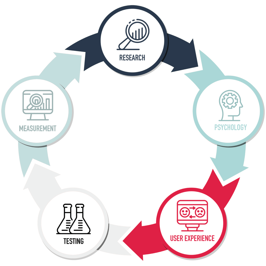
CRO comes down to more than just testing whether the blue Buy Now button converts at a higher rate than the red Buy Now button. (Although, that's part of it, for sure.) Instead, I take a more holistic approach that can work even if you currently don't have a lot of traffic coming to your website. It includes five steps:
- Research
- Psychology
- User Experience
- Testing
- Measurement
In the next few sections I'll break down how you can use each step to improve your website conversion rate.
Step 1: Doing Customer Research to Improve Your Website CRO
The first, and possibly most critical step, is to engage in some customer research. After all, your website isn’t for you, it's for your customers. It's likely your current customer base can give you some great insights into what's working and not working so well on your site.
Now, I'm not suggesting you take design and color scheme advice from the mob! More like getting some feedback on how easy it is to get around your website, or what makes sense to them and what's confusing on your home page, and so on.
There are several ways you may collect this invaluable data:
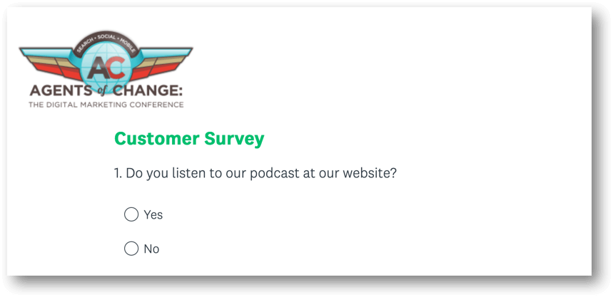
Customer Surveys
Using a tool like SurveyMonkey, you can quickly create surveys to gather feedback from your current customer base, asking them for feedback and input on your website. It also allows you to quickly scale your research, as you can create the survey once and send it to some or all of your customer base.
One-on-One Interviews
While one-on-one interviews take time and are difficult to scale, they can elicit more informative responses. Develop a set series of questions to ask your interviewees, but make sure they’re unbiased, open-ended questions to get the best responses.
“What do you like about this photo?” is leading, or biased, where “What do you think of or feel when you see this photo?” might elicit more helpful responses.
Likewise, “would you like to be able to check your account at our website” will likely get a yes/no response, while asking “what other features would improve this website?” or “what would you like to accomplish while on the site?” might generate a lot of ideas you hadn’t even considered.
Be sure to give your interviewee time to answer, and let a good three-second pause go before chiming in; you never know when someone’s going to add a critical piece of feedback, and you don’t want to hijack their thought process.
Focus Groups
While Focus Groups come with their own issues (a strong-willed participant who speaks over everyone else, for example) they can be a time-efficient way of gathering many responses at once. Like with interviews, ask open-ended questions and give people time to respond.
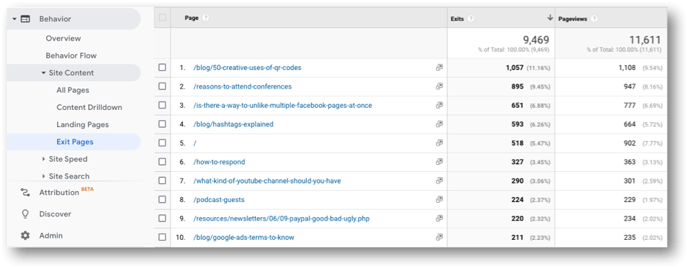
Google Analytics / GA4
Your Google Analytics can also provide great insight into the highlights and lowlights of your website experience.
While there are dozens of reports that can provide insights, here are a few key places to look:
- Exit Pages – This report may indicate pages that shouldn’t be exit points on your website, but are losing a lot of traffic. These pages are ripe for a closer look.
- Conversions – You may need to set up conversions–or Goals–in your analytics, but this can show you if you have pages that have especially high or low conversion rates
- Mobile Users – Understanding what percentage of your audience is arriving on a smartphone can help you prioritize mobile-first items on your to-do list
Behavior Analytics
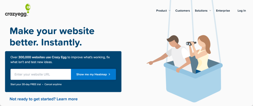
Beyond Google Analytics are tools like HotJar and CrazyEgg that can track individual users through your website (giving you insight into where things may be confusing,) scroll depth (are people leaving pages before they get to critical information,) and heatmaps (where are people looking and clicking on your page, and is that what you intended?)
While Customer Research may seem tedious to some, it’s the first critical piece to optimizing your conversion rate.
Step 2: Using Psychology to Improve Conversions
To increase conversions on your website, you should look to build trust, reduce fear of loss, and make it easy for visitors to keep moving forward. Let’s take a look at a few of the things that impact how likely it is that someone will choose to do business with you.
Leveraging Social Proof to Get Visitors to Take Action
We are social creatures! It’s in our DNA to be part of a pack, and many of us rely on the actions and reactions of others to help us form opinions or make decisions. Because of this, one of the strongest motivating factors to increase conversions is something called Social Proof.
A good example of social proof is when you get a group of people to all look up at the same time. Everyone around them will also look up…it’s almost impossible not to! After all, these people are all looking up, they must know something I don’t!
Woe is the person who doesn’t look up and misses seeing Superman…or a double rainbow…or a plummeting piano!

If we see examples of other people who have used your product or service with good results, then we are more likely to try it ourselves. After all, they must know something I don’t!
The best way to implement this on your website is with testimonials. Whenever possible, use the person’s full name, position and company (if applicable), and location. Adding a photo of the person will further add weight to the testimonial, and a video of them telling people how they were unsure, but they decided to give you a try, and now their life is nothing but wine and roses is the ultimate online testimonial!
If you have an e-commerce site, you may want to include aggregated reviews as a form of social proof. Seeing how others experienced your products (or services) can work wonders in overcoming any fear around purchase.
Using Authority to Build Trust and Influence People’s Decisions
We may live in a cynical age, but we still give weight to people and institutions of authority, and allow them to influence our decisions.
If someone dressed as a police officer stands in the middle of the street and starts directing traffic, we obey!
We can leverage this power on our website by including “badges” from relevant groups and institutions. These might include logos from the Better Business Bureau, a state certification agency, or a Google Partner badge.

Pro Tip: Consider desaturating these logos and sizing them appropriately so they don’t compete with your own brand. And definitely don’t link off to these organizations…we’re not trying to give them traffic, just borrow their authority to put our visitors’ minds at ease.
Bonus Pro Tip: If you won an award from a local newspaper or organization, like “Best Hairdresser” but that was three years ago, include the “Best Hairdresser” part along with the organization that awarded it, but drop the year. When people see that you were the best three years ago, it sends a subtle message that for the past two years there’s someone better than you, or maybe you’re not as good as you used to be!
Don’t Overwhelm People with the Paradox of Choice
People love freedom of choice, right? Well, in theory yes, but in practice, not always. When we give people too many choices they feel overwhelmed, and often make no choice at all.
In a famous study, researchers discovered that when they offered six flavors of jam they were 10 times more likely to buy a jar than when they offered 24 flavors of jam. Apparently, that’s just too much jam!
Simplify your navigation. Limit the number of categories of products you offer. For example, if you have 9 products, consider first having a choice of three categories of products, and after visitors have selected the category, then show them the three products in that category.
Improve the User Experience
OK, now this is when the rubber hits the road! You know what your customers are looking for, and you understand the psychological drives that will get them to move forward or abandon their shopping cart. Now it’s time to implement this into your site.
Design for “Mobile First”
Even if the majority of your site visitors are on desktop (which you determined by reviewing your Google Analytics in Step 1, right?) you likely are experiencing an increase in mobile traffic, at least by percentage.
More and more of your site visitors are arriving at your site on their phone, so you should be designing with a mobile first mentality.
Pull out your phone now and visit your website. Answer these questions:
- Is it easy to navigate? (Try using the “hamburger” menu and clicking on links)
- Do images look right? (Often images are sized for desktops and are cropped strangely on mobile)
- Is text easy to read? (Even if your regular text resizes itself, words that are part of images won’t resize)
- Do popups kill usability? (A popup that looks good on a website might feel overwhelming on a mobile screen)
- Is it fast-loading? (Page speed can vary between laptops and mobile devices)
- Is it thumb-friendly? (If links and buttons are too close, it can cause aggravation!)
Actually, Design for Users First
What’s more important: making a site mobile friendly or making it user friendly? Well, it’s not really an either/or situation. A mobile-friendly site that doesn’t put the needs of site visitors first will fail, as will an “empathic” website that can’t render properly on a smartphone.
In short, to increase conversions, remember that your website is for your visitors, not for you! Put their needs first and help guide them through their own, personal customer journey.
Focus on Your Navigation
Your navigation highlights the most important aspects of your website. It appears at the top of every page and helps guide the visitor through the site, communicating to them on what are the areas they should check out.
Some quick tips on improving your navigation and therefore your conversion rate:
- Limit the number of primary navigation items…try and go for six or fewer
- If you’re struggling getting down to six primary navigation items, consider moving certain items out of the navigation, such as About Us, Member Area, or other items that aren’t critical to the customer journey
- Use clear labels in your navigation instead of broad categories that any business or industry may use. I.e., “Website Design” vs “Services.”
- Long dropdowns provide a terrible user experience; if you have more than five or six items in a subnav, consider using a “mega menu” that can organize these secondary pages in a meaningful way
- Remember that not every page needs a link in the navigation; you can always include a link to the site map in the footer
Don’t Scrimp on Imagery
Whether you’re using photos, video, or charts, poor quality images can undercut your credibility and cause people to abandon your site.
Whenever possible, use professionally-shot, custom photography and video. Yes, stock photos and video can fill a gap, and are good for blog posts, but for the critical pages of your site, nothing sticks like high-quality custom imagery. A half-day shoot of your team, your building, you working with some “customers”, might only cost you 500 – 1K depending on your location.
Pro tip: Whenever people appear in photos or illustrations, pay close attention to where they are facing. Research shows that when people (in photos) are looking in a particular direction, our eyes follow theirs. If they are looking at a link or call to action, it’s more likely to catch our attention as well. If they’re facing the other way, conversion rates go down.

Words Matter
Many people choose cleverness over clarity. (God knows I’ve been guilty of that once or twice…in the past five minutes.) However, clever taglines or vague promises of “customer-centric values” or “we strive to over deliver on every order” doesn’t tell people what you do or what to expect.
Instead, state clearly that you are “Baltimore’s Best Crab Shack” or an “Accountant for Solopreneurs.”
Beyond that, write for skimmers, not for readers. That means use headers and subheads, break up long paragraphs, bold and italicize key ideas, and include bulleted and numbered lists. Think of your copy not as a big Thanksgiving dinner that never ends, but rather as bite sized tapas that can be devoured quickly and in any order.
Finally, consider hiring a copywriter to bring your ideas to life. While I'm sure you can write–you wrote that book (or ebook, or pamphlet, or email) after all–but there’s a difference between stringing some words together in a coherent fashion and creating persuasive copy that gets site visitors to take action.
A good copywriter is worth their weight in Californium.
Declutter
It’s been said above in different ways, but do your best to declutter your website. The more white space, the fewer options, the clearer the path forward, the better your conversion rate is likely to be.
Have you ever been in an Apple retail store? It offers very limited products, especially compared to those NYC electronic stores that appear to be oozing TVs, stereos, phones, bluetooth speakers, luggage, and umbrellas, as well as a thousand other items. However, Apple stores make the most money per square foot of any other retailer.
Yes, some of this has to do with the cost of their products, but by limiting product choice and by giving people space to breathe and experience their products, they are extremely successful.

Use Action Colors
Choose one color as the “action color” on your website. This is the color for all links, buttons, and other “clickable” items. Don’t use this color for anything else!
I’ve seen plenty of websites that use the same color for un-clickable headers as they do for links, which adds to a user’s frustration and can even lead them to believe the site is “broken.”
By using one color for action, you’re coaching visitors in how to work with your website. As underlines have fallen out of fashion for links, this has become increasingly important.
Always Be Testing…for Conversion Rate Optimization
I’ve often said, “best practices don’t always equal best results.”
In other words, best practices are a great place to start, but they may work best in certain industries or in certain situations or at certain times. The only way to continually improve your conversion rate is by testing different elements of your website.
What Can You Test on Your Website?
There are an infinite number of things you can test on your website to optimize your conversion rate…here are just a few:
- CTA Location – should your call to action appear at the bottom of the page or at the top? Or should it be sticky and follow people down the page?
- Color of buttons – what happens when you turn your button from red to blue?
- Headlines – try using different headlines to see if they impact your conversion rate
- Photography – is it a “hero shot” or a picture of a happy person that gets people to click, buy, or book?
- Copy length – will a long sales page or short copy convert better? Only one way to find out…
The list goes on, but you get the idea.
What Tools Can I Use to Optimize My Conversion Rate?
 There are a plethora of tools these days that help site owners and marketers test different elements of their website through A/B split testing. These tools allow you to create two versions of the same page, and then randomly send traffic to version A or version B. Over time, you’ll see which version outperforms the other.
A few of the more popular tools out there include:
Once you’ve discovered which headline or photo performs best, then you can do another A/B split test, working off the winning version by testing body copy length, the color of your buttons, and so on.
(Hey! Did you notice how the people in the balloon are looking at the signup box?)
When Does A/B Split Testing Not Work?
Split testing is most effective with bigger sample sizes. If you currently get very little traffic, then split testing can actually be harmful. That’s because the small sample size can be very misleading; by chance, the first five people to a page may all prefer a green action button, but if you ran the experiment to an audience of five thousand, it may turn out that blue greatly outperformed green in the long run.
For websites getting very little traffic you should skip A/B split testing entirely, and rely instead on customer research and the other aspects of this guide.
Step 5: What Tools Best Measure CRO?
There are plenty of tools that can help measure your CRO, including the split testing tools mentioned above.
Beyond that, having a copy of Google (Universal) Analytics and GA4 installed is a must. You can set up Goals in analytics to track whether your conversion rate is going up or down over time and keep an eye on other user behavior metrics like scroll depth, average session duration, etc. You can find the pages that continually under or over perform and make changes as needed.
What Comes Next?
Phew! That was a pretty exhausting list, right? And there’s plenty more you can be doing at each of the five steps.
The goal, however, is not to feel overwhelmed, but rather empowered.
Take these steps in order. If you’re preparing for a website overhaul or just looking to improve your conversion rate, talk to some of your customers first, as well as looking at your analytics. Then move on to the next step, then the next….
The important thing to keep in mind is that this is a process. There is no finish line outside of one you might set for yourself. You can always be improving your conversion rate, trying new photos or headlines, and experimenting with different calls-to-action.
If you’re looking for some outside help with conversion rate optimization…well, that’s one of our favorite things to work on! We love partnering with companies just like yours to find ways to generate more leads online. Feel free to contact us today for a free consultation and start generating more business tomorrow!
(Well, maybe not tomorrow, but soon!)

Rich Brooks is president of flyte new media, a digital agency in Portland, Maine, offering branding, web design, and digital marketing. He is a nationally recognized speaker on marketing, AI, and entrepreneurship.
He founded The Agents of Change, an annual conference and weekly podcast that focuses on digital marketing.
Rich is the author of The Lead Machine: The Small Business Guide to Digital Marketing, a popular and well-received book that helps entrepreneurs and marketers reach more of their ideal customers online.