
We’ve all been there: a vendor asks for your logo, color palette or typography. You dig through your files, locate a few different versions, and send what you can find. Only later do you discover they used the wrong fonts, adjusted the colors,or manipulated the logo. It no longer looks and feels like your brand.
That's not a vendor problem. That's a brand standards problem.
Brand guidelines give your employees, vendors, and marketing partners clear rules for presenting your business consistently. Often organized into a brand style guide, they cover your logo, colors, fonts, imagery, and other elements of your visual identity. It defines exactly how your brand looks and how it should be presented, so that everyone who touches it is working from the same rulebook.
If your brand is a destination, your style guide is the flight plan. Without it, you’re lost.
What Is a Brand Style Guide?
A brand style guide is a reference document that establishes the visual rules for your brand. It includes your logo, colors, fonts, imagery, and more. And it defines not just what those elements are, but how they're used.
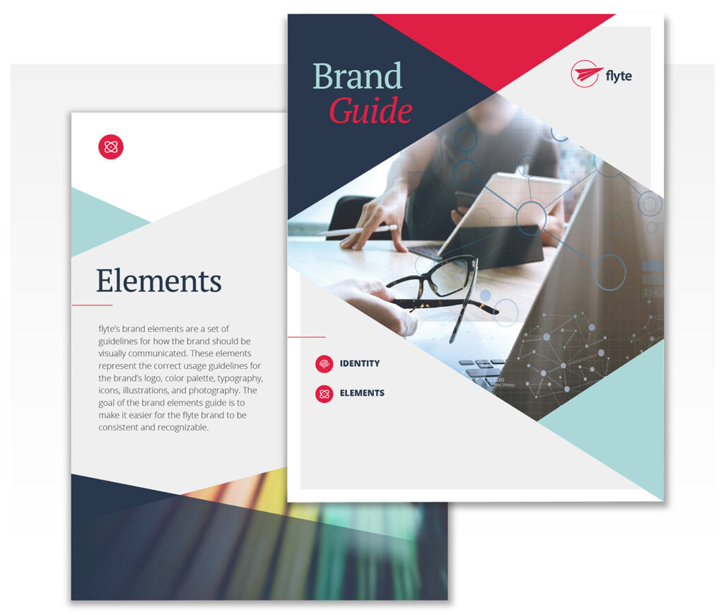
It's worth distinguishing between your brand identity and your brand style guide.
- Your brand identity is the collection of assets: the logo, the color palette, the typography.
- Your brand style guide is the rulebook for how those assets are applied.
The two should work together.
You can have a beautifully designed logo and a great color palette and still end up with brand inconsistency, because nobody documented the rules. The brand style guide closes that gap.
A good style guide doesn't just document what your brand looks like, it protects it. It ensures that whether your logo appears on a business card, a billboard, or a social media post, it looks like it belongs to the same brand.
The brand style guide goes by different names. Brand manual. Brand bible. Brand standards guide. But the purpose is the same: to give your brand a consistent, protected, and clearly defined visual identity across every touchpoint.

What Should a Brand Guide Include?
Every brand style guide is a little different, but most cover the same core elements:
- Logo usage guidelines
- Brand colors and technical color values
- Brand fonts and typography hierarchy
- Photography and brand imagery
- Illustration and icon standards
- Correct and incorrect usage examples
Here's what those are and why each one matters.
Logo Usage Guidelines
Your logo section is typically the most detailed part of the guide, and for good reason. The logo is the most visible and recognized element of your brand identity, and it's also the most frequently used.
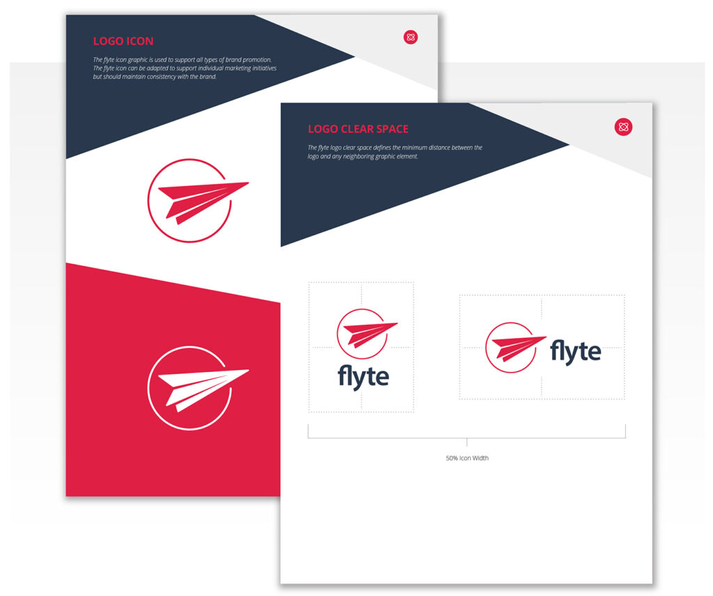
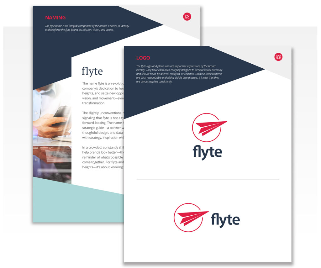
A thorough logo section covers the approved versions of your logo: horizontal layout, vertical layout, and icon usage. It also addresses clear space rules (the protected space around the logo that keeps it from feeling crowded), minimum size requirements, and color variations (full-color for standard use and one-color for minimal use). It also includes guidelines for reversed use on dark backgrounds.
Logo usage guidelines should also include a clear “do not” section. Don't stretch. Don't recolor. Don't place it on a busy background. Don't add effects. These rules might seem obvious, but without them clearly spelled out, a vendor with good intentions will eventually break the rules.
FedEx is one of the best real-world examples of logo standards executed at scale. Their logo system is precise and deliberately maintained across one of the most complex brand environments imaginable: thousands of trucks, planes, uniforms, facilities, and packaging moving through nearly every country in the world.

And then there's the famous hidden arrow in the negative space between the E and the x, a detail so intentional it became a design legend. You don't achieve that kind of consistency at that scale without rigorous logo usage guidelines governing every application.
Brand Color Palette
Color is one of the fastest and most powerful ways people recognize a brand. According to University of Loyola research,color can increase brand recognition by up to 80%. Your style guide locks in your palette and gives designers and vendors the exact specifications they need to reproduce your colors accurately, every time, across every medium.
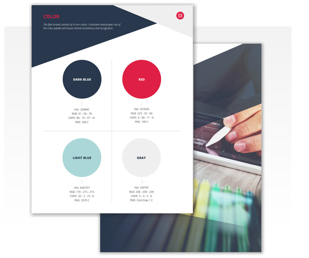
A complete color palette section identifies your primary colors, secondary colors, and any neutral tones, along with the technical values for each. HEX codes for digital use. RGB for screen. CMYK for print. Without these specifications colors start to drift.
No brand demonstrates the power of a protected color better than Coca-Cola. That specific shade of red has been meticulously maintained for over a century. It's not just a color preference. It's a brand asset. You see it on a can, a truck, or a holiday ad and you know exactly who it belongs to before you read a word. That kind of instant recognition is built on consistency, and consistency starts with documented standards.

Brand Fonts and Typography
Typography doesn't get the credit it deserves. Your brand fonts communicate personality and professionalism in ways that are subtle but powerful. Consistent typography makes a brand feel polished and cohesive. Inconsistent typography makes it feel disjointed, even when everything else looks right.
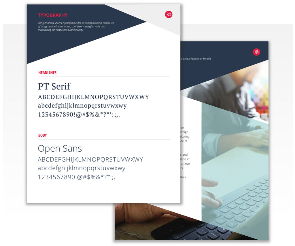
A typography section defines the primary typeface, typically used for headlines, and the secondary typeface, used for body copy and supporting text. It establishes hierarchy: size, weight, and style for headlines, subheads, body copy, and captions. It may also include approved alternates for situations where primary fonts aren't available, such as in email or presentations.
Apple is the clearest example of typography used with intention. Their proprietary typeface, San Francisco, appears consistently across every product, platform, and piece of communication. It's unmistakably, consistently Apple. And that consistency is the result of very deliberate typographic standards applied without exception.

Brand Imagery: Photography, Illustrations & Icons
Your brand’s imagery extends beyond your logo. The photos you choose, the illustrations you use, and the icons that appear throughout your marketing all contribute to how your brand is perceived. And all of them should be governed by your brand guidelines.
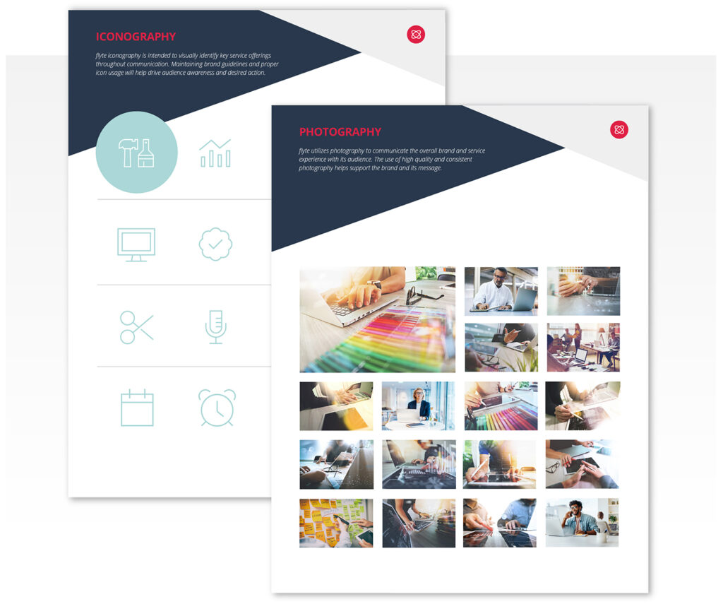
For photography, this means defining the look and feel. Is your imagery bright and clean, or moody and dramatic? Do you feature real people, lifestyle shots, or product-focused images? Candid and documentary, or composed and editorial? Defining this prevents the visual inconsistency that happens when a brand's website feels completely different from its social media, or when stock photos that don't fit the brand slip through because nobody defined what “on-brand” looks like.
For illustration and icons, the guide should establish a consistent style. Flat or dimensional. Outlined or filled. Geometric or organic. Mixing icon styles is one of those things people sense before they can articulate it. It makes a brand feel unfinished, even when the individual elements are well-designed.
Nike is the standard when it comes to brand imagery done with intention. Their visual world is built around athletes in raw, real, high-intensity moments. No glamour, no over-production, no stock photo softness

That photographic point of view is as consistent and recognizable as the Swoosh itself, and it runs through everything: ads, packaging, social media, retail environments, and their website. You always know you're looking at a Nike image before you see the logo. That's not an accident. It's the result of imagery standards that are defined, documented, and rigorously followed.
Why is a Brand Style Guide Important
You may be thinking this all sounds like something only large companies can afford to do. It's not. The business case for brand guidelines applies to any business that wants to build a recognizable, trustworthy brand.
It builds brand recognition and trust. Brands that show up the same way, every time, everywhere, build recognition faster and earn trust more easily. Every inconsistency interrupts that process. When your brand looks different on your website than it does on your business card or your social profile, it creates doubt, even when everything else about your business is solid.
It keeps employees and vendors aligned. At some point, other people will make decisions about how your brand looks. A style guide gives everyone the same reference point, so you're not starting from scratch every time your brand appears somewhere new, or correcting someone else's mistake after the fact.
It protects your brand equity. Your brand has equity: the recognition, trust, and goodwill you've built over time. Inconsistency erodes that equity quietly. A slightly different logo here, a wrong color there, a mismatched font in a presentation. These things can compound over time and a brand style guide is what keeps that from happening.
It saves real time and money. Fewer revision rounds. Less back-and-forth with designers. Fewer reprints. When everyone has a clear set of standards to work from, projects move faster and errors get caught earlier. Over time, that adds up.
Brand Standards Are for Every Size Business
Brand style guides can be comprehensive, detailed documents that cover every conceivable use case across every medium. But they don't have to be. For most small and medium sized businesses, a focused guide covering logo usage guidelines, color palette, typography, and imagery is genuinely sufficient.
If you're just getting started, even a simple brand reference document is better than nothing. It keeps your work consistent, gives your vendors what they need, and signals to the world that your brand is intentional.
And as your business grows, your style guide grows with it. The time to start is now, not after years of inconsistency have already done their damage.
Is your brand style guide missing, outdated, or collecting dust? flyte can help you build practical visual standards your employees, vendors, and marketing partners will actually use.
Ryan is responsible for working with clients to help them design a successful web presence. Working in design studios from New York City to Portland, Ryan brings over 24 years of design experience to flyte. His diverse design background brings a fresh approach to each new project.